![DND_LogoAnimCover](http://philipjohnson.com/wp-content/uploads/2016/05/DND_LogoAnimCover.gif)
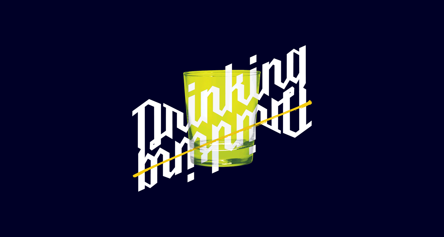
Drinking Not Drinking Vol 2
Graphic Identity
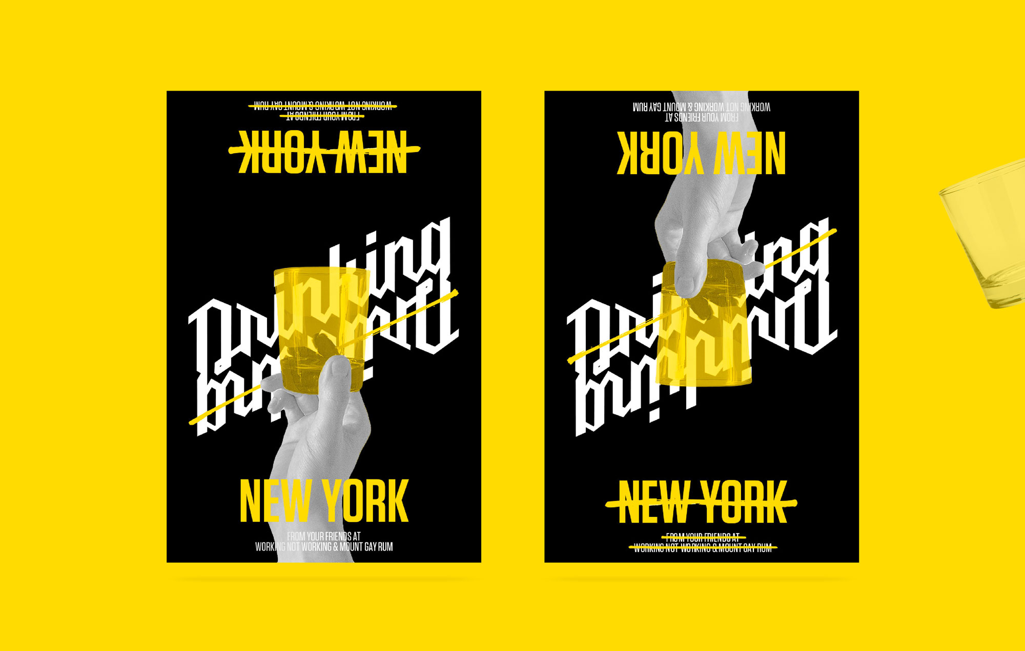
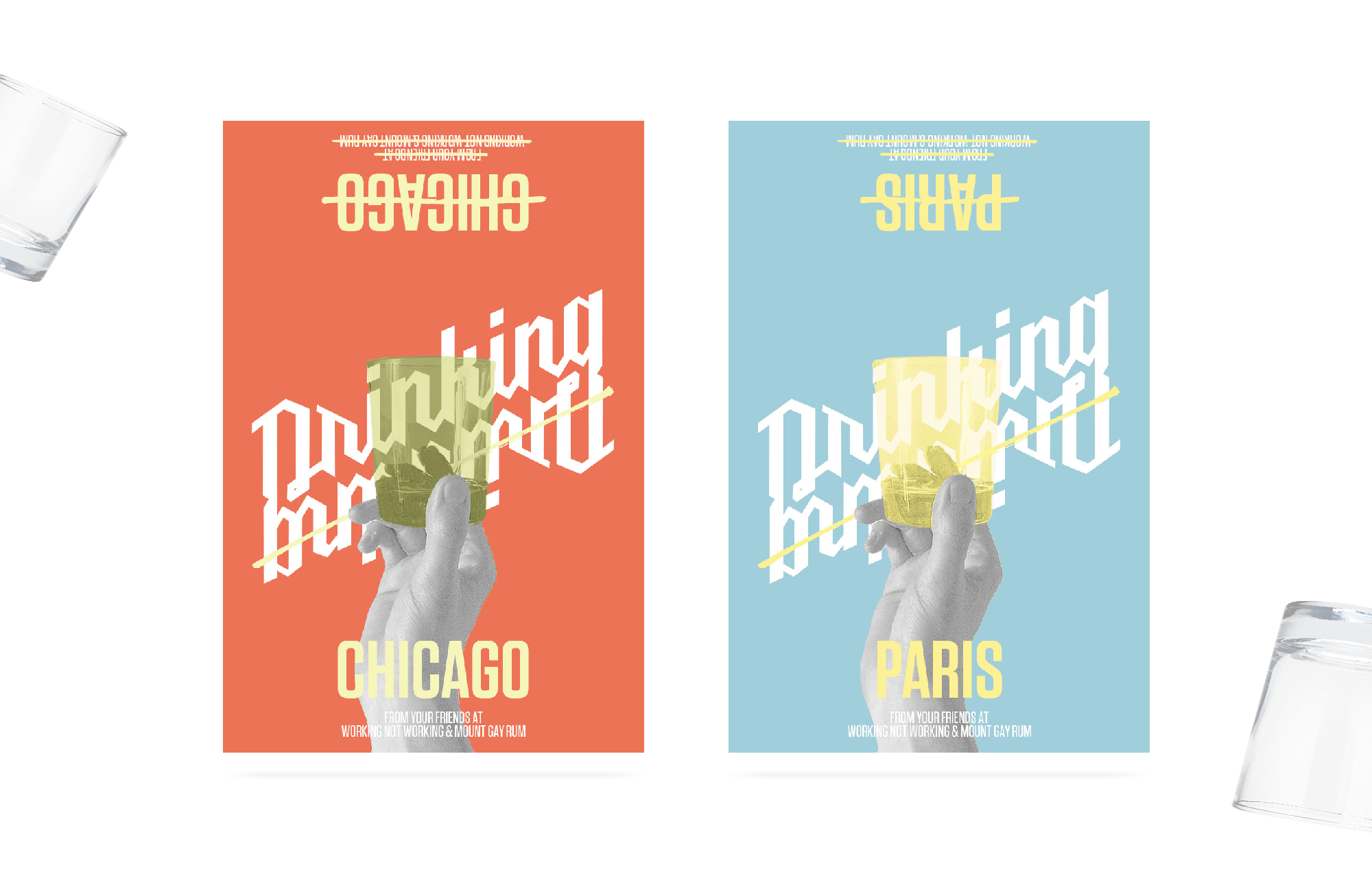
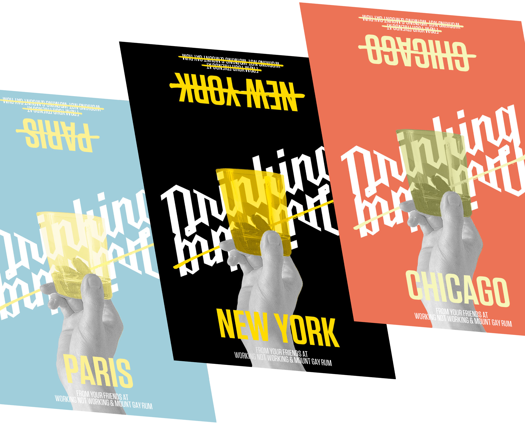
You're either drinking or you're not. The new identity for Working Not Working's event series "Drinking Not Drinking" works as an ambigram of sorts. The idea is simple: an upturned glass means you're drinking. An overturned glass means you're not. Taking a cue from WNW's larger brand (and propensity for crossing things out), all materials follow the same principle and can be rotated to your heart's content.
![2PosterIntro3](http://philipjohnson.com/wp-content/uploads/2016/05/2PosterIntro3.jpg)
![3Up2B](http://philipjohnson.com/wp-content/uploads/2016/05/3Up2B-1.png)
![3Spread2](http://philipjohnson.com/wp-content/uploads/2016/05/3Spread2.png)